Oct 21, 2010
In this post, I’m going to talk about the importance of notification and as a deaf person myself, notifying deaf people is a little different than those who can hear. Obviously, hearing people set their ring tone to whatever they please to—be it a pop song or a game song like Super Mario Bros. But for us as deaf people? we rely on visual notifications.
Which mobile device has the best notification? it’s the Blackberry. It’d flash a dark red light at the corner of its form factor and is easily recognizable afar. That’s mainly why I’ve sticked with my blackberry to this day. It’s also got a strong vibration too. I have to admit that even the hot-selling iPhone doesn’t have a good notification; its vibration is rather weak at best. That’s why you’ll see many deaf people keep reaching into their pocket and try to feel the vibration or they’d just check for the sake of it and perhaps get lucky getting a new message. Changing scenes here a bit, which webmail has the best notification? it’s Gmail, bar none. It checks for new email every minute and effortlessly pops a message into your Gmail.
So, being notified visually is pretty critical to me and that’s why I’ve stayed with the Blackberry and Gmail, the best kind of notifications you can find on the market today.
Tags:
Oct 20, 2010
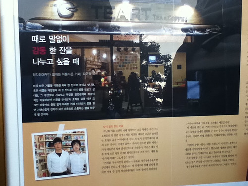
One time I was shopping with a friend. She urged me to buy slim pants. I’ve never worn slim pants before as I like them just straight loose. She said that’s what most Korean guys like to wear and tried to explain to me. I don’t really get what she means till she showed me this picture. Ah, okay.

That is supposedly the standard look for a Korean guy who studies at an Ivy league college.
Tags:
Oct 20, 2010
I was cleaning up a bit on my website and someone asked me why did I choose those particular colors—mostly in grayscale. To be quite honest, I kind of followed the color scheme and layout structure from Wikipedia because I at least figured that almost everyone has already read articles on Wikipedia and I read lots of articles in there. So I thought it’d make the most familiar-looking layout for visitors to read. I also think a lot about psychology because basically, our brains have to interpret what’s there in front of our eyes and rendered by light. Even newspapers are laid out in a similar style with its grid layout, so things don’t really change but onto a new medium. As for the width size of the layout, I sort of followed kottke.org website, which is a popular blog and he posts lots of links. For some reason, I like having both nav bars at the top and bottom as I feel it’s akin to having two columns at both ends of a building, giving it a structured look and a sign that you have reached at the bottom with links you can click on or quickly go somewhere else, which is probably more likely. On related marketing news, checkout this online reputation management tool that can help you build your brand.
So, that’s how my website rolls, although I have plans to revamp the design soon.
Tags:
Oct 13, 2010
in 1985

Future Seoul metro map by 2020

Tags: